Are you on Goodreads? It's a great place to be, not only to get recommendations on books that appeal to you, but also to engage with other readers and authors.
I'm part of several writer groups on the site and occasionally, there is an author preparing to release a new book who shares details with the group. On one such a occasion a few weeks back, an author shared their book cover and I couldn't help but cringe. The image on the cover was pixelated, the typography was bland, and the color palette consisted of grey and white.
It was a mess.
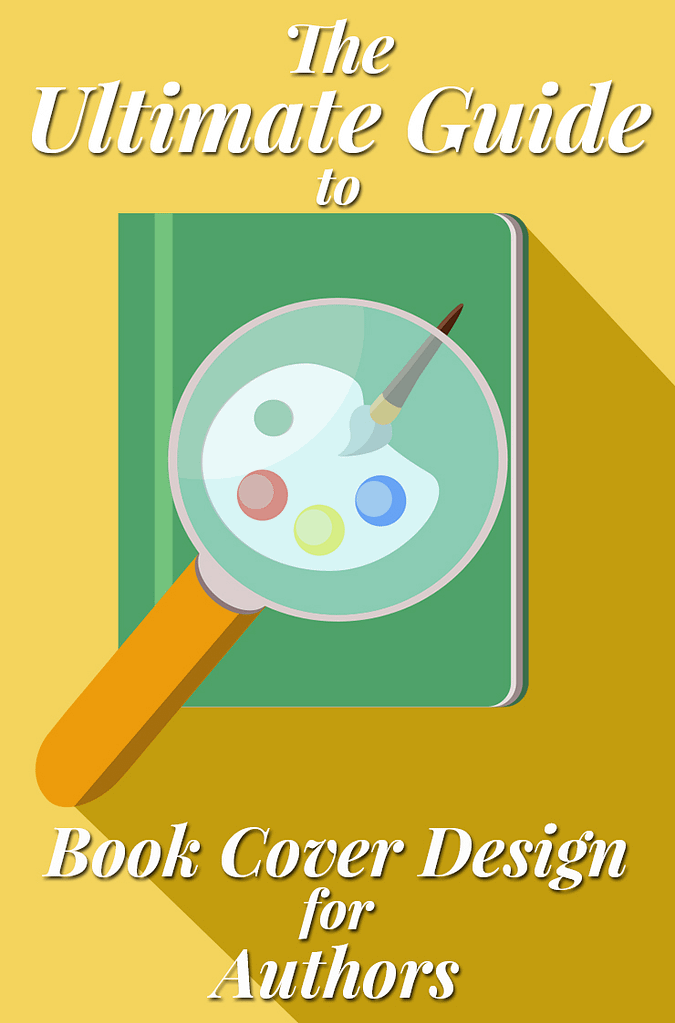
When it comes to book design, the major pain points for most authors designing covers are image quality, typography, and color palette.
Let's start with images and finding the right ones for your cover.
Use High Quality Images for Covers
First of all, if you are working with a graphic designer who is creating a unique image for you by means of photo manipulation (using various stock images to create the main image on the cover) make sure they send you the image file with the largest resolution possible.
On Amazon, book cover images have to be a minimum of 625 x 1000 pixels (width x height) but for best quality your image should be at least 2500 pixels on the longest side. However, your cover can be as large as 10,000 pixels on the longest side and Amazon KDP will automatically resize it accordingly.
Now if you submit a cover image that's at the minimum level or lower, the chances of it showing up pixelated are higher. Additionally, if you compress the image file you will run into more pixelation issues, so try to avoid compression if possible.
With regard to file types for images, always use the JPEG format. It's the most common and accepted format digitally. JPEGs also tend to be more compact in size than other file types, which is significant since Amazon doesn't accept image files larger than 50MB.
Now I personally prefer the PNG file format for my cover art because it's a lossless format, which means it doesn't lose image quality when it's compressed or resized. JPEG is not lossless and that's why it gets blurry and pixelated more often. Unfortunately, Amazon and most other online bookstores don't accept the PNG format because it's a bigger file size due to the high resolution. If you're given the option to use a PNG file though, opt for that over JPEG every time.
Aside from getting a high resolution file and using JPEGs, it's also important to use high quality images in your cover art. If you're creating the design yourself with stock photography, make sure all the images you use have similar dimensions.
If you're short on cash to purchase stock photos, download my PDF list of stock photo sites with free high quality images by clicking below!

For example, let's say you're trying to create a historical romance cover. You've got a photo of a model that'll be in the foreground and you've got an image of the prairie that'll serve as the background of the cover. If the background's dimensions are 640 x 480 and the model's dimensions are 1200 x 1069, you're going to have a very blurry background after the image is pieced together.
Always match the dimensions of all the images you're using or get the highest resolutions possible so your design efforts aren't in vain!
Choose Typography that Works for Your Genre
Typography is the art and technique of arranging type to make written language readable and appealing. The arrangement of type involves selecting typefaces, point size, line length, line-spacing (leading), letter-spacing (tracking), and adjusting the space within letters pairs (kerning).
Simply put: typography is what makes your title stand out on a book cover due to artistic flair or embellishment of the font.
So often, self-published authors settle for bland or weak typography that doesn't do their book justice. Opting for Times New Roman or Papyrus fonts for your title will make your book look amateurish and likely hurt sales. You want to choose a strong font that matches the theme of your book.
For example, if you're designing a cover for a historical romance novel, you might want to choose a font that resembles handwritten script from a century ago. It'll present the proper aesthetic to a reader of that genre. But if you slap any font you like over the art, without considering the themes of the genre or story, it will likely miss the mark.
Typography for non-fiction is much more straightforward. Generally, non-fiction is solving a problem or pain point for the reader. Most non-fiction books use a bold, strong font that is not artsy or embellished. Like non-fiction itself, it's giving you the facts and getting right to the point. Great fonts for non-fiction include Baskerville, ChunkFive, and Franchise.
One of my favorite resources for finding great fonts with styles that complement both fiction and non-fiction is Font Squirrel. There are numerous fonts on the site, both free and paid, and quite a few have been used on bestselling books. Remember, getting typography right is all about complementing the themes and genre of your book.
Pro Tip: Explore bestsellers in your genre and examine the typography closely. Match your cover's typography with those books and you won't go wrong!
Find the Right Color Palette for Your Book
Most self-published books miss the mark on the color palette because many authors are unfamiliar with the fundamentals of the color wheel and color theory. This gap in knowledge about colors often leads to drab or garish color options for images and text on indie books. You only need to peruse a website like this to see why color palettes matter when designing books.
So let's discuss color theory and why it's significant. In art, color theory deals with color mixing and the visual effects of a specific color combination. There are also definitions (or categories) of colors based on the color wheel: primary colors, secondary colors and tertiary colors.
Like typography, color theory can get very technical and complex. This is a field that artists have been studying for hundreds of years! For our purposes, we only need a basic understanding of which colors are complementary on a book cover and provide a pleasing aesthetic to potential readers.
Let's reference the color wheel:

If you've taken an art class in grade school, you should be somewhat familiar with this. The color wheel logically structures all the colors of the rainbow with relation to one another. In the color wheel I provided, you'll notice red is diagonally positioned from green. This means they are complementary to each other. When colors are complementary they provide a striking contrast that is visually pleasing to the eye. That's probably why all the red and green Christmas decorations are so popular!
Why is this important?
Because when you set out to design a book cover, you DO NOT want to choose colors that clash like red and orange.
Typically, to get the boldest and most pleasing aesthetic shoot for complementary colors. If your image has a dominant blue color palette, use orange or white to accentuate it. If you're using darker shades of colors, don't do what many indie authors do and choose gray for the typography. It obscures your words and looks ugly to the reader.
Last piece of color theory I want to touch on is the emotions colors evoke. I'm sure you've heard of "cool" colors and "warm" colors. Blue is a cool color, whereas orange is a warm color. Each evoke different emotions when viewed by the human eye. It's the reason why most people don't paint their bedrooms bright red!
Depending on the genre of your book and the mood you're trying to evoke from the reader, use cool and warm shades for the best effect. Writing a thriller? Use cool colors in darker shades to evoke mystery or gloom. Writing a chick lit book? Use lighter coolers that are warm or hot to bring the happy or exuberant mood you're story is aiming for. It can be lots of fun to make the right combinations of colors with the emotional atmosphere of your story.
That's it for the three major pain points of book cover design! Remember to grab the list of free stock photo sites below so you can use high quality images for your book covers!

I'd love to hear your thoughts below! Did this post help you understand the difference between good cover design vs. bad cover design? Are you ready to start designing your own book covers?


This is a great article on cover designing! Will be a lot of help for me. Thanks! (sharing it)
🙂
So a nice tip, i am a book cover designer and this will really add to my knowledge, thanks.
https://goo.gl/AFaYbw